
A calm, easy-on-the-eye beach house website with soft blue tones, warm accents, and a smooth, intuitive browsing experience.
A calm, easy-on-the-eye beach house website with soft blue tones, warm accents, and a smooth, intuitive browsing experience.
A calm, easy-on-the-eye beach house website with soft blue tones, warm accents, and a smooth, intuitive browsing experience.
Date
May 16, 2025
Date
May 16, 2025
Category
Website Design
Category
Website Design
Introduction
Designing calm, effortless browsing
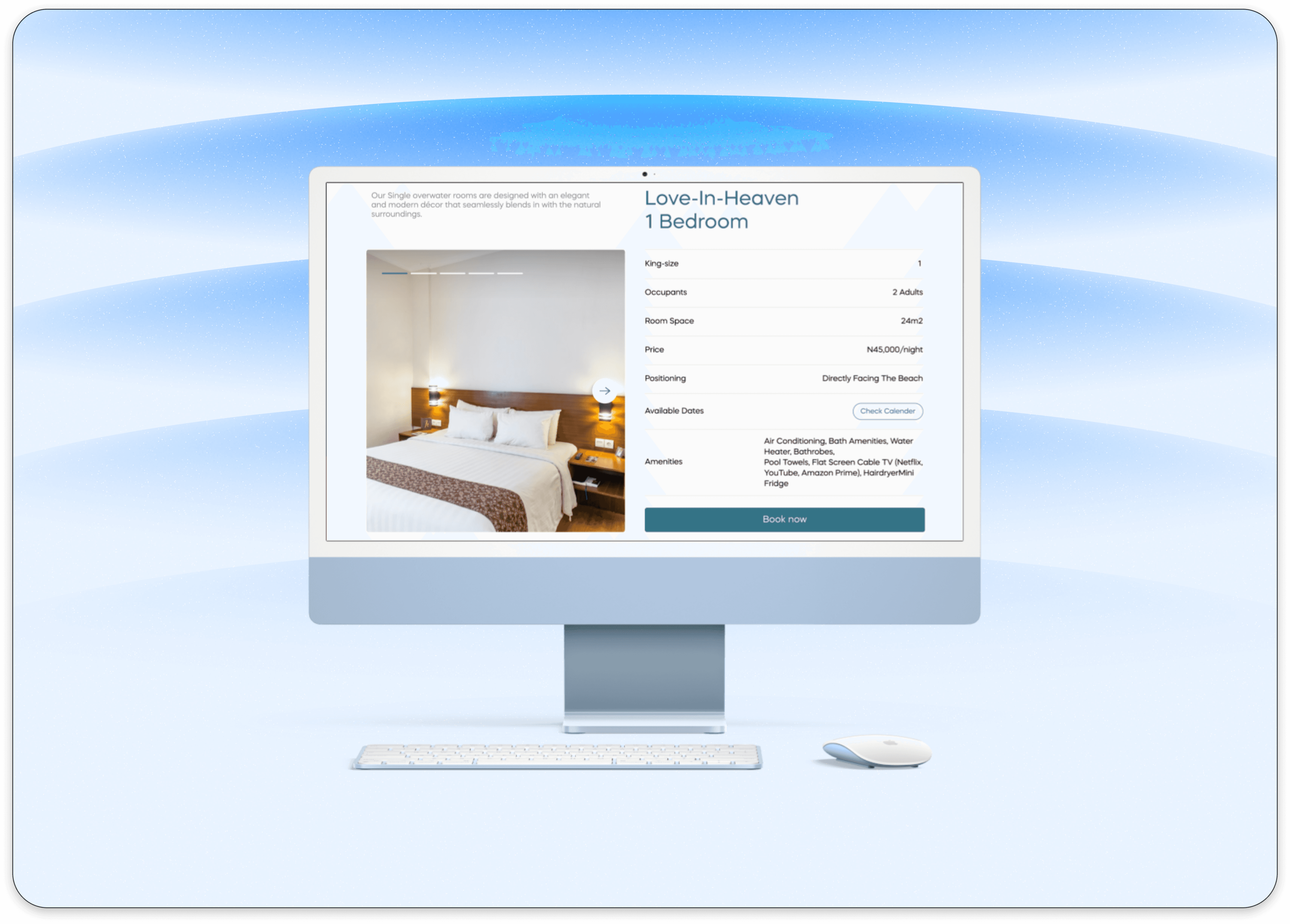
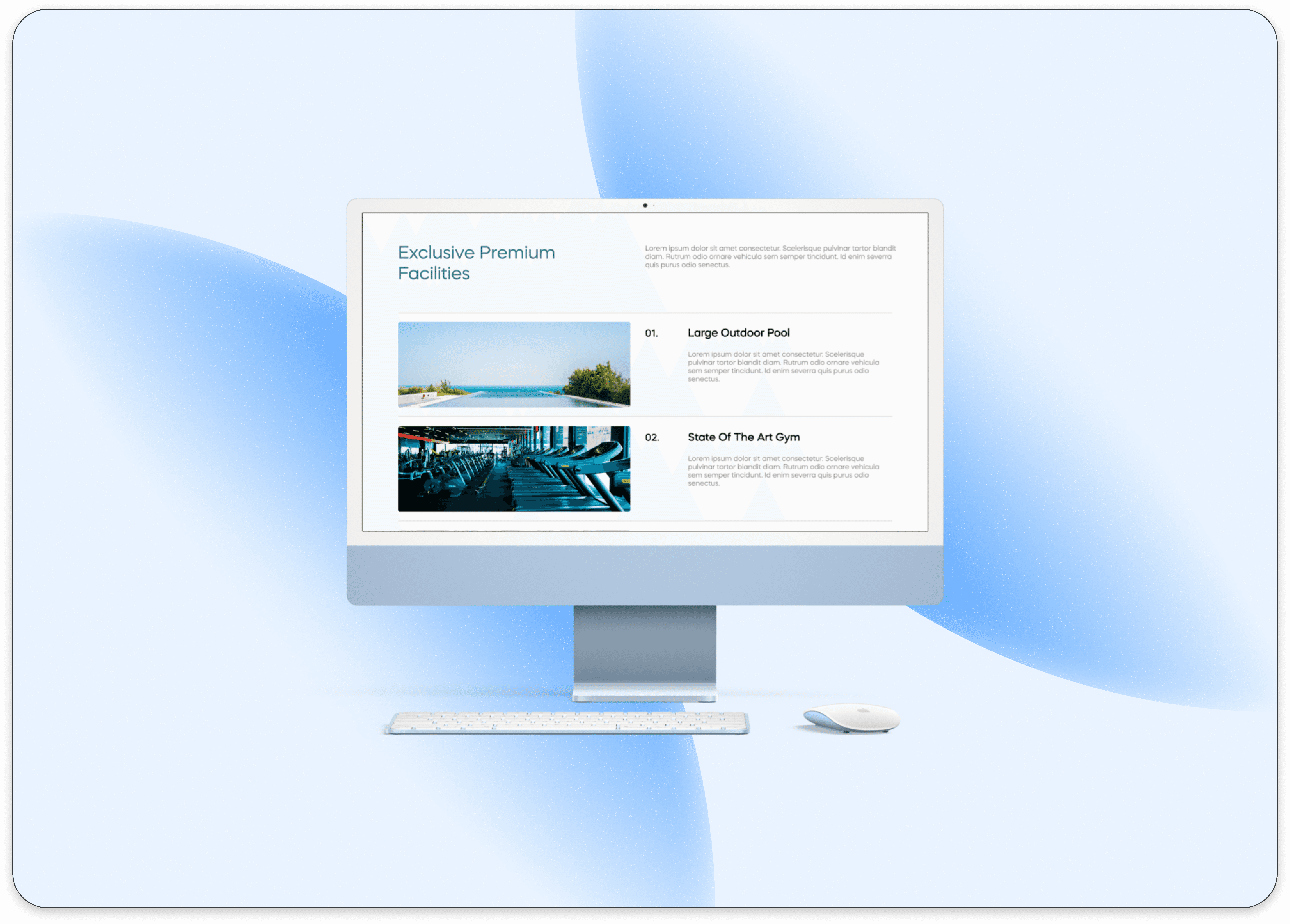
Beach Pub needed a website that felt as relaxing as the location itself , clean visuals, airy spacing, and a soft blue palette that instantly creates a “by the water” mood. The goal was to build a digital experience that feels welcoming, simple, and easy to explore.

Main Idea
Simple choices that make exploration effortless
I designed the layout to feel light and intuitive, with clear sections, soft gradients, and smooth transitions. Navigation is straightforward: users can browse rooms, amenities, and bookings without confusion.
Key elements include:
Soft blue color system inspired by ocean tones
Spacious layouts for a calm visual flow
Minimal interactions that guide users gently
Clear CTAs for booking and inquiries
Image-forward sections to showcase the beach atmosphere
These small UX choices make the website feel friendly, organized, and easy to use.
A soothing, modern website that feels like vacation
Conclusion
From the layout to the color palette, every detail was designed to create a calm digital experience. The result is a website that’s visually beautiful, simple to navigate, and perfectly aligned with the relaxed personality of the Beach Pub brand.


Explore more
Little behind-the-scenes snapshots from my design journey, experiments, app and web design, and the stuff that finally shipped.


A calm, easy-on-the-eye beach house website with soft blue tones, warm accents, and a smooth, intuitive browsing experience.
A calm, easy-on-the-eye beach house website with soft blue tones, warm accents, and a smooth, intuitive browsing experience.
A calm, easy-on-the-eye beach house website with soft blue tones, warm accents, and a smooth, intuitive browsing experience.
Date
May 16, 2025
Date
May 16, 2025
Category
Website Design
Category
Website Design
Introduction
Designing calm, effortless browsing
Beach Pub needed a website that felt as relaxing as the location itself , clean visuals, airy spacing, and a soft blue palette that instantly creates a “by the water” mood. The goal was to build a digital experience that feels welcoming, simple, and easy to explore.
Main Idea
Simple choices that make exploration effortless
I designed the layout to feel light and intuitive, with clear sections, soft gradients, and smooth transitions. Navigation is straightforward: users can browse rooms, amenities, and bookings without confusion.
Key elements include:
Soft blue color system inspired by ocean tones
Spacious layouts for a calm visual flow
Minimal interactions that guide users gently
Clear CTAs for booking and inquiries
Image-forward sections to showcase the beach atmosphere
These small UX choices make the website feel friendly, organized, and easy to use.
A soothing, modern website that feels like vacation
Conclusion
From the layout to the color palette, every detail was designed to create a calm digital experience. The result is a website that’s visually beautiful, simple to navigate, and perfectly aligned with the relaxed personality of the Beach Pub brand.
Explore more
Little behind-the-scenes snapshots from my design journey, experiments, app and web design, and the stuff that finally shipped.